Astrid Primadhani
Jakarta, Indonesia
In August 1854 a deadly cholera outbreak struck the Soho neighborhood of London.1 Within thirty-six hours, rapid death ensued as the dense and unsanitary condition of the working-class neighborhood became a haven for the spread of the bacteria. In two weeks, over seven hundred people, 10% of the neighborhood, died.2 Elsewhere around the world, nineteeth century urban populations were likewise at the mercy of diseases such as cholera that caused widespread deaths. Epidemiologists recall it was the visual data analysis of John Snow that pinpointed the roots of the disease through a method of disease mapping. His findings transformed the health of urban cities.
John Snow was able to locate the source of cholera by familiarizing himself with the social and spatial dynamics of the neighborhood. Contrary to the beliefs of doctors of that time, Snow believed that cholera was waterborne, not airborne. His investigations lead him to the disease and poverty stricken neighborhood of Soho, where he meticulously collected the data of the afflicted and the dead. In a book that recounts the outbreak, The Ghost Map: The Story of London’s Most Terrifying Epidemic, Steven Johnson has noted that Snow had strong social bonds to the inhabitants of the neighborhood. It “gave him both an awareness of how the neighborhood actually worked, and credibility with the residents.”3 His sharp observational skills of their routine activities led him to conclude that a shared, ingested resource was spreading the disease. His main suspects were the water pumps, dotted at various places in the neighborhood.
His approach to the cholera outbreak in Soho demonstrated the value of easily readable visual techniques to depict an epidemic. In the nineteenth century, disease mapping was common but not effective, such as the 1798 Seamen disease map of yellow fever in New York.4 What now distinguished Snow’s map was that he began his investigation with the theory that cholera was spread by water. To expose the position of the contaminated pump. Snow marked with a thick black line on a commercial map the number of deaths per household, treating each death quantitatively as a bar and thus drastically affecting the interpretation of the data. By contrast, an earlier map by Edmund Cooper, an engineer for the Metropolitan Commission of Sewers, indicated the number of deaths by one thick line for the household followed by slim markings for the number of deaths.5 This obscured the relation between the deaths that occurred and the location of the pumps.
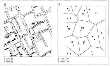
Snow’s map showed a distinct correlation between the location of deaths and their proximity to the Broad Street water pump. In an 1855 report, Snow wrote, “it might be noticed that the deaths are most numerous near to the pump in Broad Street.”6 This was a popular pump because of the good taste of its water. The majority of deaths located around the pump convinced him that he found the main transmitter of the disease. His visual reasoning used proximity as a measurement to relate the affected households and their nearest water source. He pushed this reasoning further, attempting to draw irregular lines similar to Thessian polygons that justify the proximity of the pump to the afflicted.7 These polygonal lines are the median between each point and assess the boundary of influence of different points on a two-dimensional plane. The resulting boundary determined a “cholera area.” It was the area that was closest to the pump and had the most potential to be afflicted by cholera. On the street-level any potentially thirsty civilians in this “cholera area” would find the Broad Street pump the closest source of water.
Snow informed the government of the Broad Street pump’s lethal water, but it was a struggle to convince the population that cholera was a waterborne disease and to push the government to restructure the sewage system of the neighborhood. The Committee on Scientific Inquiries of the General Board of Health rejected Snow’s conclusion that the pump was the source of cholera. They used his own map as an argument against his theory, speculating that as there were several other pumps in the surrounding area one could not blame one in particular. Edmund A. Parkes, a researcher in cholera, falsely believed, “This certainly looks more like the effect of an atmospheric cause than any other.”8 At that time supporters of the miasmic theory still believed that cholera was caused by foul air, arguing that there were several anomalies in the map, that the workhouse nearest to the pump had almost no deaths but there were several in households that were farther away from the pump. Snow clarified these inconsistencies by conducting several interviews, showing that the workhouse had its own water pump and did not use the one from Broad Street, but that households that were farther away were obtaining their water from there.
Eventually, the government allowed Snow to remove the handle of the Broad Street pump. Years later, they excavated the well beneath the pump and were appalled to find that the brickwork separating the well from a cesspit of human waste had decayed, allowing free contact between human excrement and food or water. This unsanitary condition also prevailed in other poor neighborhoods of Victorian London. According to Johnson’s The Ghost Map: The Story of London’s Most Terrifying Epidemic, incredibly foul stenches from open cesspits could be sensed throughout many of London’s nineteenth century neighborhoods. Problems with the Broad Street pump were traced back to an early victim of cholera in Soho, a baby named Lewis whose soiled diapers were washed and thrown inside the adjoining leaking cesspit, spreading cholera to the entire neighborhood. These discoveries of decayed brickwork prompted further changes by the government such as closing cesspits deep inside the ground and redesigning the sewage systems of the city.
Snow identified the Broad Street pump as the sole agent responsible for the 1854 cholera outbreak in Soho. Removing the handle of the pump put an end to that particular outbreak, but it was only some thirty years later, in 1883, that Robert Koch identified the bacteria and confirmed Snow’s theory.9 When Snow died in 1858 the public was still not convinced of his findings, but epidemiological investigation of the outbreak initiated waves of transformation in disease mapping and urban sewage systems. His legacy is found in the investigation of modern epidemics. GIS software now locates and analyzes the distribution of disease to specify geographical environmental risk factors. Snow’s findings ushered the reformation of sewage systems, making it possible for dense urban populations to exist. For his incredible work in Soho, Snow is remembered as one of the fathers of epidemiology.
References
- Steven Johnson. “Metropolis Rising.” The New York Times. November 15, 2006. Accessed December 14, 2017. https://johnson.blogs.nytimes.com/2006/11/15/metropolis-rising/.
- Ezra Haber Glenn. “International Planning and Development.” Journal of the American Planning Association74, no. 3 (June 12, 2008): 11. July 23, 2008. Accessed December 14, 2017. doi:10.1080/01944369408975559.
- Steven Johnson. The ghost map: the story of Londons most terrifying epidemic–and how it changed science, cities, and the modern world. London: Penguin, 2008.
- Thomas Fisher. “Viral Cities.” Places Journal. October 01, 2010. Accessed December 15, 2017. https://placesjournal.org/article/viral-cities/.
- Howard Broday, M.D., Ph.D, et al. “The later “Government” maps.” Map-Making and Myth-Making in Broad Street: The London Cholera Epidemic, 1854. Accessed December 14, 2017. http://www.ph.ucla.edu/epi/snow/mapmyth/mapmyth4.html.
- Tim Koch. “The Map as Intent: Variations on the Theme of John Snow .” Cartographica: The International Journal for Geographic Information and Geovisualization39, no. 4 (Winter 2004): 1-14. 2004. Accessed December 15, 2017. doi:10.1353/car.2013.0003.
- Koch, The Map, 5
- Broday, The later
- Ibid
- Cliff, Andrew D., and Peter Haggett. Atlas of Disease Distributions. Oxford: Blackwell, 1993.
ASTRID VIDYA PRIMADHANI has a degree in architecture from Universitas Indonesia. She is interested in the connection between architecture and urbanism across different studies.